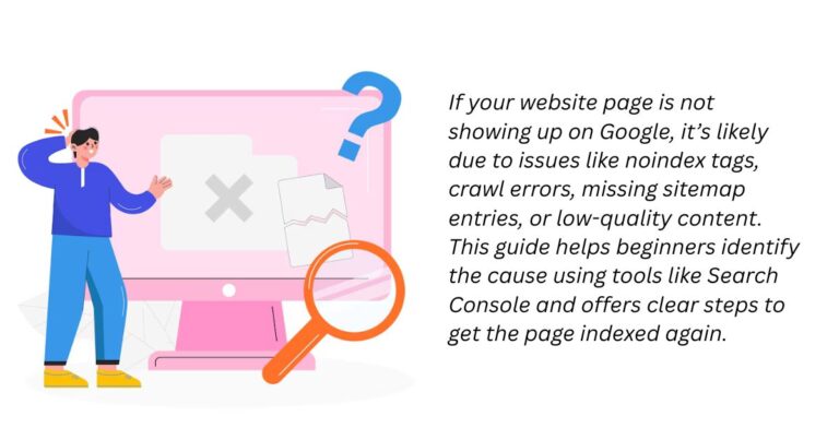
When Google Search Console shows the “video outside of viewport” error, it means that your embedded video is not fully visible on the user’s screen without the need to scroll horizontally or vertically. This usually happens because the video size is fixed and does not adjust according to different screen sizes, especially mobile devices. To fix it, you need to make your videos responsive so that they automatically resize based on the user’s screen dimensions.
In this blog, I will break down everything from scratch — what this error means, why it happens, and how you can fix it step-by-step even if you are a complete beginner.
What Does “Video Outside of Viewport” Mean in Simple Words?
The viewport is the visible area of a web page that users see on their device screen without needing to scroll.
If your video is wider or taller than the viewport, users must scroll to see the full video. This is a poor user experience.
When Google notices that users cannot easily view your video, it flags the issue under mobile usability errors or page experience issues in Search Console.
This can negatively impact your rankings, Core Web Vitals, and mobile-friendliness score.
In short: If your video does not fit nicely into the screen without scrolling, it is outside the viewport.
Why Does the “Video Outside of Viewport” Issue Happen?
Several reasons can cause this problem:
- Fixed Width Embedding: When you set a video width in pixels (like 800px), it doesn’t adjust on smaller screens like smartphones.
- Lack of Responsive Design: If you don’t apply responsive CSS, your video remains the same size across all devices.
- Default CMS/Theme Settings: Sometimes WordPress themes or other CMS platforms embed videos in a non-responsive way.
- External Embed Codes: Videos added through external codes (YouTube, Vimeo, etc.) may use hardcoded dimensions if not adjusted manually.
Real-Life Scenario
Imagine you run a cooking blog. You embedded a YouTube recipe tutorial using this code:
htmlCopyEdit<iframe width="800" height="450" src="https://www.youtube.com/embed/yourvideo"></iframe>
On your laptop, everything looks fine. But when someone visits your site on their mobile phone, the video overflows the screen because mobile screens are much narrower than 800px.
Result? Visitors have to scroll sideways, leading to a bad experience. Google flags this page under “video outside of viewport” in your Search Console Mobile Usability report.
Step-by-Step Guide to Fix “Video Outside of Viewport”
Let’s now fix this issue properly.
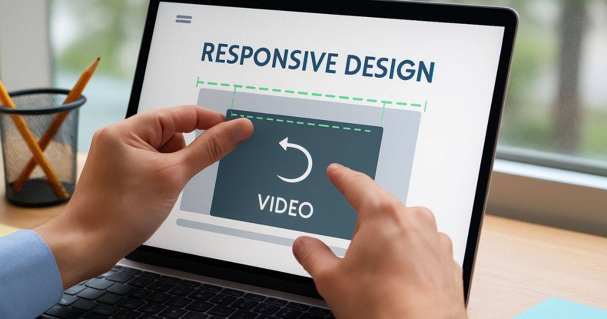
1. Wrap the Video with a Responsive Container
The best way to make your video adjust to any screen size is by using a wrapper div with special CSS.
HTML:
htmlCopyEdit<div class="video-container">
  <iframe src="https://www.youtube.com/embed/yourvideo" frameborder="0" allowfullscreen></iframe>
</div>
CSS:
cssCopyEdit.video-container {
  position: relative;
  width: 100%;
  padding-bottom: 56.25%; /* This keeps 16:9 video aspect ratio */
  height: 0;
  overflow: hidden;
}

.video-container iframe {
  position: absolute;
  top: 0;
  left: 0;
  width: 100%;
  height: 100%;
}
What this does:
- The
.video-containertakes the full width of the screen. - Padding is used to maintain the correct video proportion.
- The
iframeis stretched to fill the container without breaking the aspect ratio.
Now, the video looks perfect on all screen sizes — mobile, tablet, laptop, or desktop.
2. If You Are Using WordPress
Good news! If your website is built on WordPress, you don’t always have to code manually.
- Block Editor (Gutenberg):
Simply paste your YouTube URL inside a YouTube block. It becomes responsive automatically. - Classic Editor:
You can wrap your iframe inside a div and add custom CSS as shown above. - Page Builders (like Elementor, WPBakery, etc.):
Most have a “responsive” setting when adding videos. Always check the mobile preview. - Plugins:
Plugins like “Responsive Video Embeds” can automatically handle it for you.
3. Double-Check Your Fixes
After applying the fix:
- Test your page using Google’s Mobile-Friendly Test tool.
- Manually view your page on a smartphone or reduce your desktop browser size to see if the video adjusts properly.
If everything is responsive, Google will remove the “video outside of viewport” warning during the next crawl.
Bonus Tip: Improve Performance with Lazy Loading
Videos are heavy. If you want your pages to load faster, you should also lazy load your embedded videos.
This can be done by adding a loading="lazy" attribute to your iframe:
htmlCopyEdit<iframe loading="lazy" src="https://www.youtube.com/embed/yourvideo" frameborder="0" allowfullscreen></iframe>
This tells the browser to load the video only when it comes into view, not when the page first loads.
Benefits:
- Faster initial page load
- Better Core Web Vitals scores
- Smoother mobile browsing experience
One of my clients runs a photography tutorial blog.
They had embedded 30+ videos without using responsive methods.
More than half their traffic came from mobile, and they were losing rankings because of poor mobile usability scores.
I helped them:
- Wrap all videos in a responsive div.
- Add lazy loading for better speed.
- Retest using Google’s Mobile-Friendly tool.
Result? In just one month, all mobile usability errors were cleared, and the site’s mobile traffic improved by 18%.
“Video outside of viewport” is a serious but very easy-to-fix problem.
It’s mainly about making sure your embedded videos are responsive so they fit all screen sizes properly.
Here’s a quick reminder:
- Use a responsive wrapper with proper CSS.
- Test on multiple devices after embedding.
- Improve page speed with lazy loading.
Fixing this not only improves your SEO but also provides a smoother, faster, and more professional experience for your visitors. If you want your website to be mobile-friendly and future-proof, never skip responsive embedding!
Frequently Asked Questions
The viewport is the visible area where your webpage or graphic is displayed on the screen. The viewBox, mostly used in SVGs, defines the coordinate system and scaling of the graphic inside that viewport. In simple terms, viewport controls the display size, and viewBox controls how the content fits inside it.
The view is what a user actually sees on their device screen, like a webpage or an app. The viewport, on the other hand, is the visible area of a web page inside the browser window. Web developers design pages to fit properly inside the viewport for better user experience.
The best way is to place the video iframe inside a div with CSS that maintains the aspect ratio and allows the video to scale with the screen width. This method ensures your video looks perfect on all devices, including desktops, tablets, and mobile phones, without breaking the layout.
Yes, it can affect SEO negatively. Google considers mobile usability as an important ranking factor. If your video is not properly sized for mobile devices, it can trigger mobile usability errors in Search Console, lower your Core Web Vitals scores, and ultimately harm your website’s visibility in search results.
Your video appears outside the viewport because it has a fixed width or height that does not adjust to different screen sizes. This causes users to scroll horizontally or vertically to view the video, leading to a poor mobile experience and triggering errors in Google Search Console.
To fix a video outside the viewport, wrap it in a responsive container using CSS. This ensures the video automatically resizes based on the device screen. Alternatively, use built-in responsive video options if you are on WordPress, or apply lazy loading to improve performance alongside fixing the viewport issue.
Explore for more such info – https://thejatinagarwal.in/
